

D’Ont Poke the Bear Cider Can Refresh
Overview
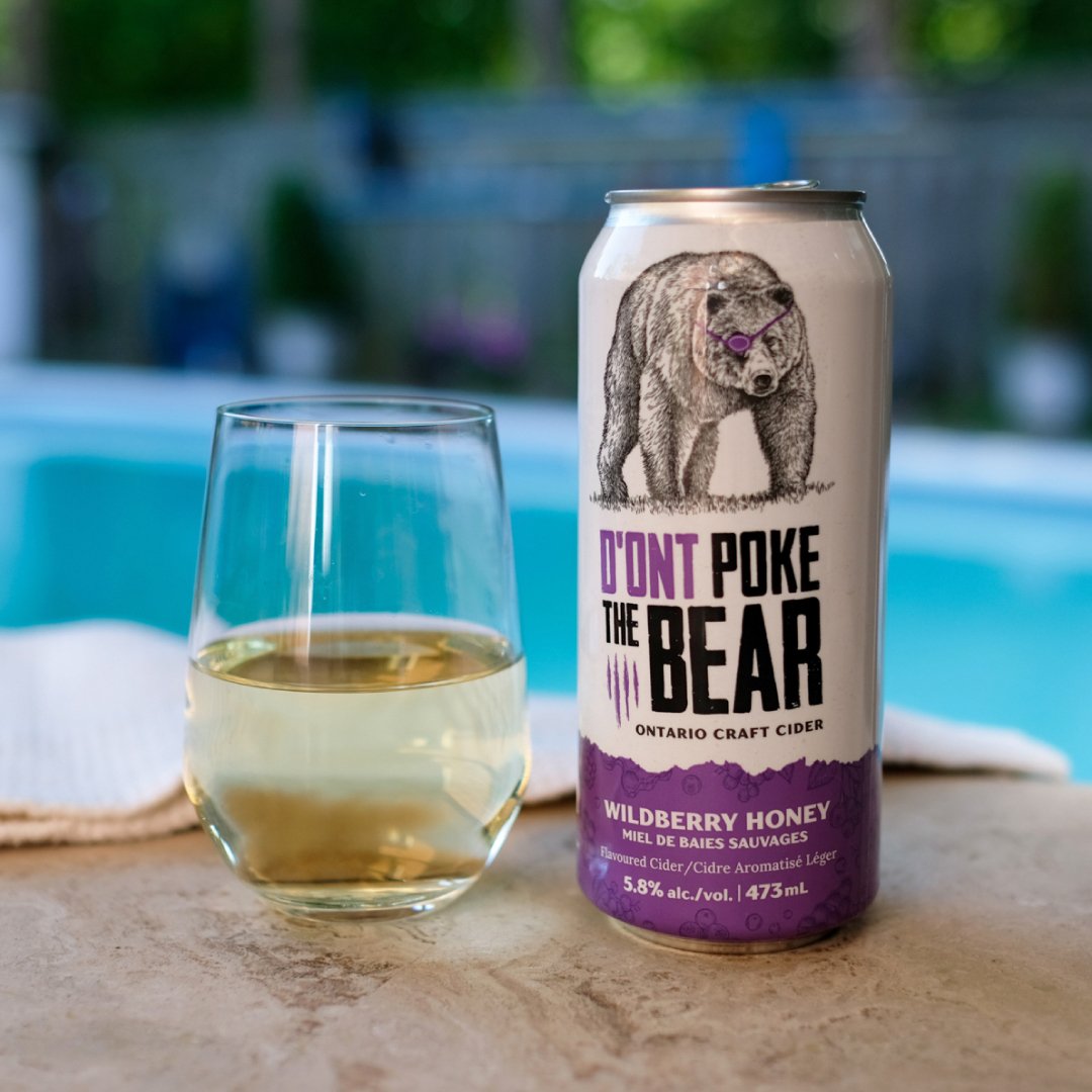
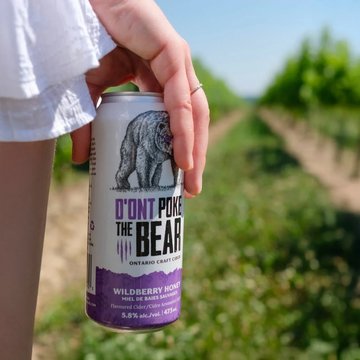
For the launch of their new Wildberry Honey cider, D’Ont Poke the Bear sought a refreshed label design. The update aimed to create a more refined, modern and visually cohesive look while maintaining the essence of the original branding. Subtle, intentional details were added to enhance the brand without overshadowing it.
Key updates include:
Improved wrap layout to ensure design continuity around the can, creating a seamless visual experience.
Custom secondary illustrations were added to symbolize unique flavour.
Updated typography to a more mature and clean typeface, enhancing legibility while giving the brand a more elevated tone.
SCOPE
Design refresh

CUSTOM ILLUSTRATIONS
Hand-drawn secondary illustrations were created to represent the distinct flavour profile. Each asset was initially illustrated in Procreate, then refined and vectorized in Adobe Illustrator to align with the established colour palette.
TARGET AREAS AND SOLUTIONS
Typography:
The original typefaces conveyed a rugged, distressed look that emphasized a sense of toughness. However, this direction skewed masculine and didn’t fully support a more inclusive tone.
Solution: Replaced secondary typefaces with more neutral, modern options to broaden appeal and create a more balanced brand voice.
Label Wrap Alignment:
The previous label design had a visible disconnect at the wrap seam, disrupting visual continuity.
Solution: Adjusted the wrap layout to ensure seamless alignment around the can, resulting in a more professional and cohesive presentation.
Texture Use:
The background texture, resembling aged paper, contributed to a vintage or dated feel, which could limit the design's freshness and relevance.
Solution: Reduced the texture to create a cleaner, more modern visual identity.